
NYC Health
THE CITY
Asked about the data on NY1 late Monday, de Blasio called the disparities “horrible.”
“What we’re talking about here is the really painful, really unfair history of race and class in this city and in this country,” he said.
The mayor cited the city’s work to secure insurance or medical care for all its residents to address the preconditions associated with poor COVID outcomes — which include diabetes, hypertension and compromised immune systems.
“These are things that obviously get back again not just to racial disparity but to economic disparity — to folks who never got the health care they deserved because they didn’t have the money they deserved,” de Blasio said.
Elected officials have argued that access to testing has not been equitable across neighborhoods, and a number of them said they’d been pushing City Hall to release more specific data on deaths sooner.
Councilmember Inez Barron (D-Brooklyn), who represents Starrett City, said her district was left to suffer for weeks as she pleaded with the mayor’s office to release more details about neighborhood impacts of the virus.
“Why aren’t residents — which is the hotbed for this disease — why aren’t these people being tested? It’s illogical to me,” she said.
“They know that senior concentrations, and black and brown communities and other areas are hotbeds, but yet you don’t make provisions in the very areas where we see the numbers soaring.”
Showing posts with label map. Show all posts
Showing posts with label map. Show all posts
Tuesday, May 19, 2020


Wednesday, April 1, 2020
de Blasio's crack coronavirus squad put out another vague contagion map

The zip codes with the most cases are colored deep purple and there is a big window of the amount of cases and the tabulations don't even start at the following number (112 should be 113 and so on). Even during a crisis, the city still can't help being easily subjected to ridicule.
Update: The NY Post corrected the glaring errors and confirmed the effects the pandemic has had on lower income working class residents.

A new city map showing confirmed coronavirus cases based on patient address by ZIP code suggests the poorest New Yorkers are being hardest hit by the pandemic.
Wealthier parts of the city, including much of Manhattan, waterfront sections of Queens and brownstone Brooklyn, have the fewest number of coronavirus cases, according to the map released by the city Department of Health.
A stark example of the wealth gap is the Rockaway section of Queens. The richest part of the peninsula that incorporates Belle Harbor where homes sell for over $1 million has at least 112 cases while Far Rockaway with its public housing complexes has up to 947 cases.
Data scientist Michael Donnelly, who’s been crunching the city’s coronavirus numbers since the start of the outbreak, noted the new map tracks with earlier MTA turnstile data.
Those maps showed ridership plummeting in Manhattan stations in mid-March, while New Yorkers from the outer reaches of the outer boroughs continued commuting.
“Over time we start to see the effect of the fact that Manhattan and the inner zip codes of Queens and Brooklyn have a lower positive rate because they were able to bend the curve before the outer boroughs,” Donnelly said.
Neighborhoods with fewer than 200 cases — like Park Slope, Brooklyn and Greenwich Village in Manhattan — count many white-collar professionals who can telecommute as residents.
“I think the clear next step there, is if that’s true, then there’s a real socio-economic inequality, inequity in the fact that these ZIP codes, which also tend to skew lower socio-economic, are also going to be the ones who are harder hit by this pandemic,” Donnelly said.
“Broad strokes, those tend to be the wage workers, emergency service workers that are exposing themselves more and more over time,” Donnelly said.
Many front-line workers, from grocery store clerks to EMTs, live in the outer boroughs. Their jobs require them to use the subways while the majority of New Yorkers stay home.
Looks like there might be a need for a general strike to stop this contagion from spreading even more.
And at this moment as I am typing this, de Blasio's Department of Health still hasn't fixed those numerical errors.
Saturday, March 28, 2020
Coronavirus map shows the poorest New Yorkers are getting infected the most
NY Daily News
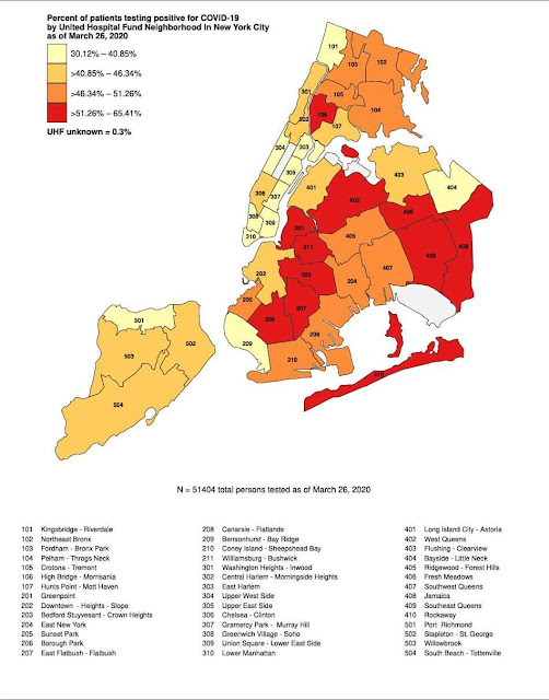
A city map suggests what many New Yorkers already suspected: Coronavirus is hitting the poorest neighborhoods hardest.
The map shows the biggest share of people testing positive for the deadly virus are in a swathe of the city’s poorer neighborhoods, which stretches in a boomerang shape from central Brooklyn through Queens and out to the Rockaways.
A chunk of the South Bronx is also being slammed with more than half the patients testing positive.
Well-heeled
neighborhoods like Riverdale, Bayside, Bay Ridge and most of Manhattan
are faring relatively much better, with less than 40% testing positive
for COVID-19.
Anti-poverty
advocates say that the findings likely reflect the fact that poor and
working-class people have been far less able to abide by
social-distancing rules.
They are also less likely to have jobs that allow them to work remotely like better-off New Yorkers.
Subscribe to:
Posts (Atom)


