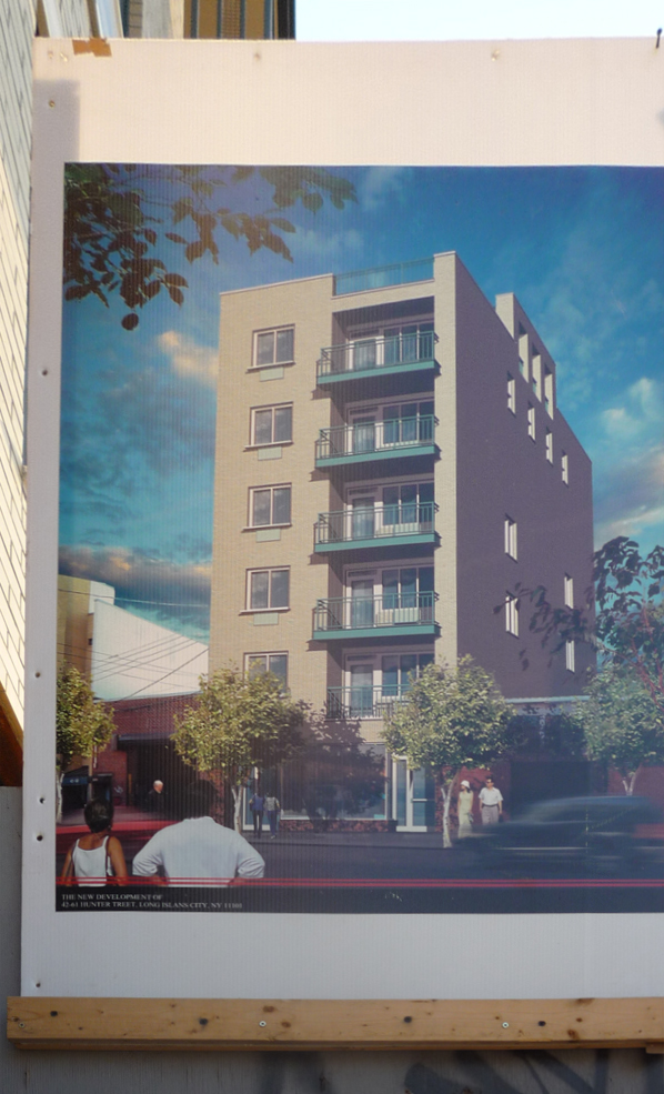
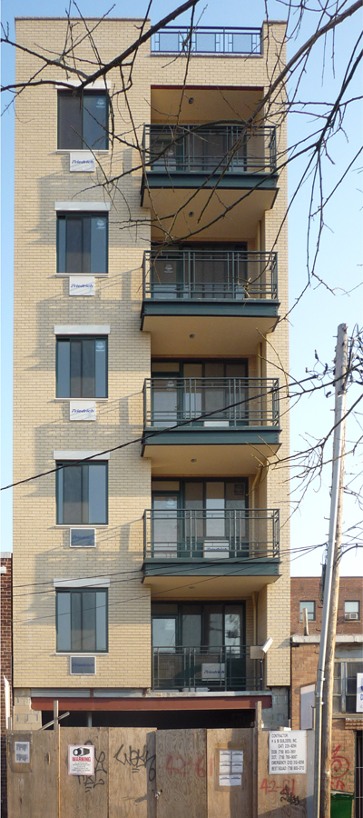
 Okay, it's got Friedrich A/C units, so it's technically not a Fedders, but still... notice the people in the rendering gawking at the shitpile in disbelief.
 This baby at 42-61 Hunter Street is a fine example of Queens Crap at Queens Plaza. It's a couple of lots away from Fusion LIC which is across the street from the now-demolished municipal parking garage. Also, mere steps away from Star Tower, which almost a year later, is still an empty lot.
LIC architecture: Always good for a laugh. (Also approved by the FDA as an alternative to syrup of ipecac for cases of poisoning.)

11 comments:
This doesn't even begin the touch the ugliest structures there. At least some light will penetrate the street.
Although this piece of crap is not pretty by any means, when it comes to Queens Plaza I have a feeling that it is better then whatever was there before.
It was a factory before. Terrible! We need condos, not jobs!
Sure, and who will move into a place with heavy traffic on one side, and a railyard on the other?
You have to break yourself of a mindset that building=good.
I am sure in the community that the people live (who designed that simplistic notion) this is not the case.
People want to move into a community, not a warehouse of beds.
Great place to raise a family.
They can go over to the freight yard and steal coal and resale it for fun.
Pop open a boxcar.
Grafitti a locomotive.
Throw rocks at rats.
Possibilites are endless.
If they get sick they can go over to St Johns around the corner and send their kids to PS1 and LIC High School.
Woops! My bad.
Sorry, thought it was 1909.
No nearby schools or hospital in 2009.
So I guess it was a better place to live 100 years ago than today.
But someone will make money and when you get down to brass tacks, that is all that matters, right?
Now THATS progress!
If only we could build this right next door to Bloomie......
Check out the cool graphics for the Star Building.
Funny they don't show the wall of buildings that will line that waterfront and block that wonderful view.
BTW, did someone ever share those renderings with the community?
I could see it if there were other structures the same height on either side, but it looks totally out of place there.
What happened to buildings with character? It is not just in NYC that this is a problem. It is starting to pop up in Grand Rapids, MI too, with thoughtless glass and brick buildings replacing the old structures that actually had character.
Thankfully this fad has not shown up in my town of Grand Haven, MI yet, partly because our city does quite a bit to force builders to fit the historical character of this waterfront town.
jesus that's ugly.
Post a Comment