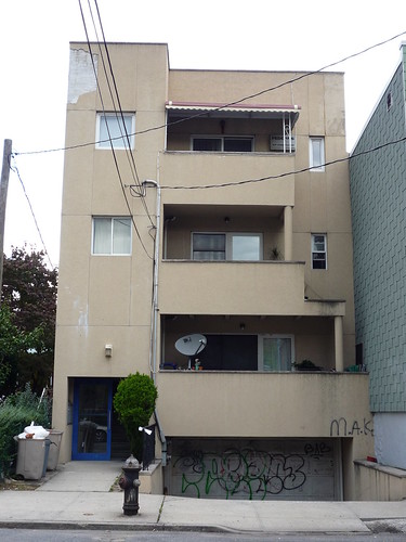
Sometimes you come across a building that just leaves you speechless. Such was the case when I found this gem.
Here's what a cheap piece of Queens Crap built during the 1980s mini development boom looks like after 18+ years or so wear and tear. (My favorite: "No. of dwelling units: N/A") Homes decades older than this look much better. Actually, it was probably pretty hideous even when it was first built. But at least it wasn't covered in graffiti with chunks of facade peeled off. We should have a lot of crap houses in this condition to look forward to in the future.

16 comments:
All it needs is a few "vibrant and diverse" youths hanging out front wearing doo-rags and the scene is complete!
Now that the building boom is coming to an end, I'll bet that twenty years from now this period(as far as development is concerned) will be known as the Bloomberg years.
You may find yourself saying:
"Remember back in the day when Mayor Bloomberg let developers ravage the city?" or "Hey Junior, look at the box with windows. This really ugly mayor named Bloomberg did that."
C of O on this is for five (5) Units! 1993
Why dont we invent a new architectrual style and name it after our mayor?
If you have a 'Queen Anne', how about a 'Mayor Mike' .. or 'Queen Mike'?
Ideas?
This is incredibly elitist. Not everyone can afford a beautiful building. Granted, too often I think people with money ignore exterior architecture and focus only on square footage and interior. But still, there are always trade-offs that many people ignore. Regulations that would prevent this type of building also drive the cost of housing beyond the means of many.
This is what much of Tokyo looks like.
Just because a person is of modest means, Jake, is no reason to be treated like shit, at work, by the landlord, or elitists who think that crap is 'good enough' for them and anything more is not possible because some developer wants a big fat profit.
Every hear of Ford? of LeFrak? or Woolworth? They seemed to have figured it out.
In those those days -- when those words meant something -- a place like this would be a canditate for urban renewal.
Good God I Hate Elists!
Mexico City, Bogata? ... Nope, New York City! Fucking A.
This is incredibly elitist.
Yes, how "mean spirited" of us!
Next they'll tell us that New York City needs more "vibrant and diverse" architectural styles, and that Kingston, Jamaica shantytowns and Brazilian favela style housing would be an appropriate start.
This is what much of Tokyo looks like.
Tokyo doesn't have the hoi polloi and riff-raff that Queens does. You can also walk your dog at 2AM on the streets of Tokyo and not have to bring your revolver with you.
Regulations that would prevent this type of building also drive the cost of housing beyond the means of many.
How do you regulate common sense and creativity?
A few simple things would have help the appearance of this box:
• Put the terraces in the back, where it's probably quieter and might actually be used for getting air and sunshine rather than putting up satellite dishes.
• Provide a tidy way of storing garbage and recyclables in the front.
• Use an exterior that won't peel off in 20 years. We all know it's true that putting a little more money up front often saves on maintenance costs in the future.
And the landlord should really keep on top of the repairs. What we need more of in this city is landlords who CARE about the business of housing people decently, as opposed to being in the business of caring only about their bottom line. It's tough being a landlord, but it's only made worse if you become callous about it!
It looks like it should have a Humvee parked out front, a radioman on the roof, and a machine gun sticking off of one of those balconies.
As an architect, I can say that this property actually has a tremendous amount of potential. It's really a victim of poor maintenance.... and some poor aesthetic decisions made by the owner. If you look up the early modern work of Adolf Loos or Richard Neutra you can see how beautiful the monolithic type of modern style can be. If you took down that bad canopy on the top floor, painted the door and garage door red, patched the facade, painted it a french gray, updated the light fixture, and managed the garbage collection--this could be a pretty sharp building. These are all superficial changes. There's no reason to be so dire.
Actually Mr. Architect, I think your recommendations would work for that building and turn it from nauseating to nice. Good ideas!
As an architect.....There's no reason to be so dire.
Vitruvius is rolling in his grave!
It kind of looks like somewhere in Beirut in the early 90's.
This is a victom of shoddy workmanship and shoddy materials.
Post a Comment